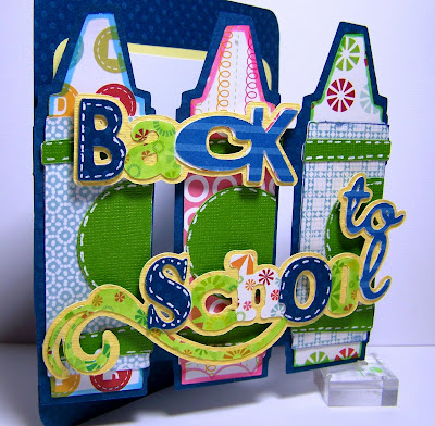
Using Cricut Design Studio and the My Community cartridge, I created a custom card design. I welded the shadow cut of the three crayons to a square, adding two long thin rectangles across the crayons to hold them together. As you can see after the words were added the rectangular bars a nearly invisible.
I had fun with my crayon colors, choosing bold prints as my crayons and crayon labels. I then chose lime green for the contrast color.
The Back to School phrase was cut in four pieces - the shadow in yellow, the icon cut in a white grounded multi print, a blue stripe and a darker blue solid. In the end, I thought that the white background multi print was too light, so I colored over most of the white letters with a lime green Copic marker.
I used pop dots to affix the words to the front of the crayons. The dimension added by the pop dots allow for the letter to have a bit of a visual pop from the card.
While you are out and about on the Internet today be sure to drop by Bitten by the Bug 2 and check out the design team's fabulous back to school projects! The BBTB2 site will be up at 11 am eastern time. I like to post a bit earlier so as to not miss my early readers.
I will be back with a couple of fun projects to share this week – including a unique birthday card for my future daughter-in-law.


