Back To Vegas - More Scrapbook Pages
My trip to Las Vegas continues to be relived in my scraproom. Sadly I do not think I am even halfway though the photos. Did I mention that I printed 300 photos??? I am going to be reliving Vegas and the Grand Canyon all summer long!
On the last day of our trip we went back to the Hard Rock Casino (dh and I had gone there the day before by ourselves) with MFK and her dh. We at lunch ate Mr. Lucky's 24/7, and for those of you who know of the steak and shrimp (not on the menu) special.... YES WE DID!!! It is not on the menu but you can order Mr. Lucky's special which is steak, large grilled shrimp, potato, & salad all for $7.77!
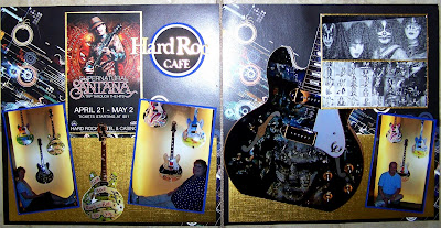
There is a bit of a back story (don't I usually have a back story?) that goes with this layout. The one show my dh wanted to see that we did not have prepurchased ticket for was Carlos Santana, who was performing while we were there. The only night we had open (due to prior planning while at home) was Thursday. Thursday was Santana's off night. We were sad but we went to the House of Blues and viewed a nice acoustic show over dinner. And who walked in during our dinner? Carlos Santana! Seriously.
At lunch the next day at Mr. Lucky's dh and I were telling MFK and her dh about seeing Santana. They were surprised and a bit green. Until... WHO should walk by the table because he too was enjoying lunch at Mr. Lucky's??? Carlos! (I figure after two near meetings we are on first name basis now). We were all too stunned to grab the cameras. We did, however, get his little post card sized show poster (thanks to Kathy).
For the right page, I enlarged the Beethoven guitar to an 8 x 10 inch photo and used it as a background image. I cut out a 4 x 6 inch photo of the "God gave rock & roll to us" guitar and used it between the photos on the left page. I used a lot of gold metallic cardstock as background elements and as matting (forgive the glare). I used Plantin Schoolbook and tried to create the Hard Rock Cafe title for my left page.
Between the metallic paper and the glossy photos these two pages had serious glare-factors while photographing. The pages look really nice in real life.
Labels:
C-Plantin Schoolbook,
Layout


